Fisk Alloy
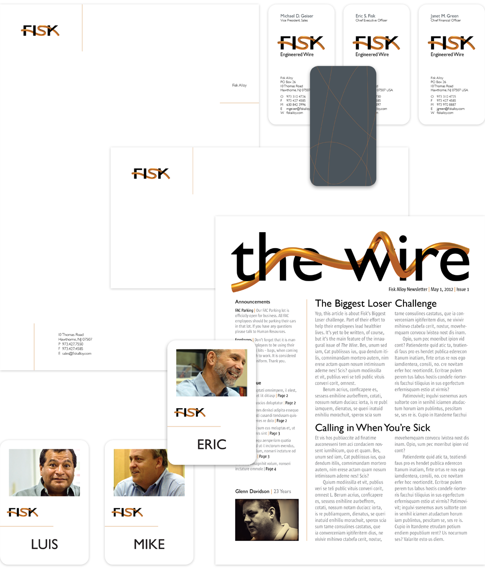
By fashioning the Fisk logo out of wire we evoke the product itself. It conveys — literally in an instant — the business of Fisk, and expresses the creativity and innovation that defines the company.
Fisk’s brand identity had to achieve multiple objectives. As a comprehensive expression, the body of work had to accurately reflect the personality of the company, which is decidedly egalitarian (as is evident in the employee badges). It also needed to bring Fisk into the new century and beyond, and speak to the company’s global presence (hence the use of European formats). Finally, it had to reconcile the sometimes conflicting ideas of stability & reliability against invention & creativity. Thus, the juxtaposition of thin, rigid wire elements against clean backgrounds, and photography that turns an industrial factory, gritty machinery and wire into art.


